- BEHANCE
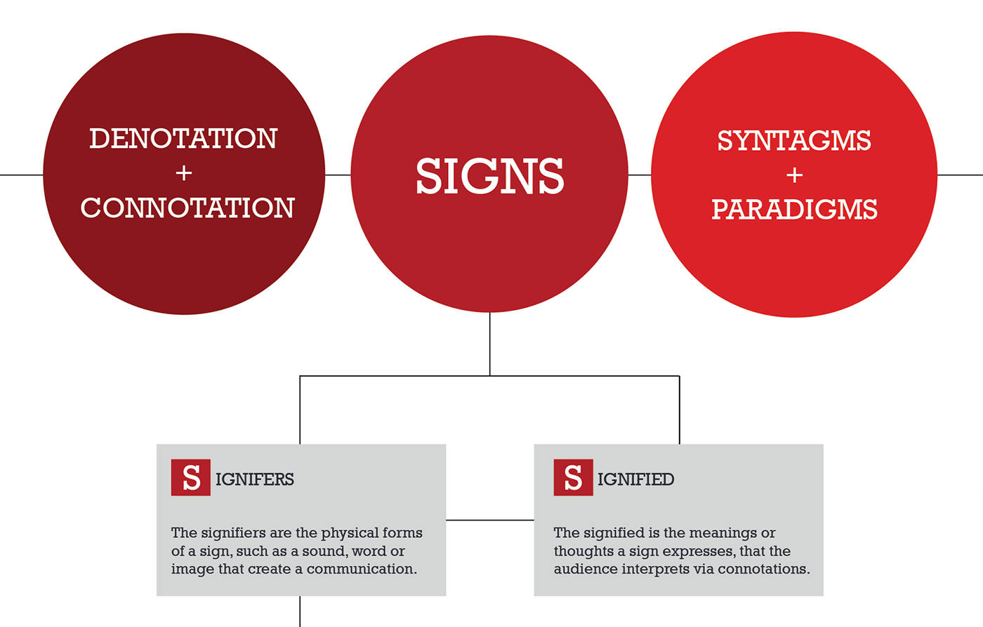
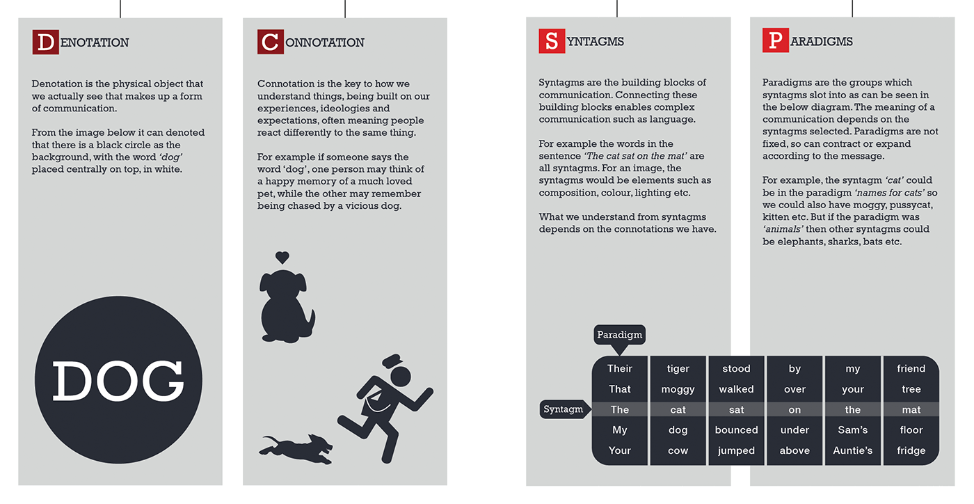
Above is an infographic i found that summarises what Dr Flude has taught - click to enlarge!
Signs are particularly useful for quick and simple identification, and are used extensively in today's world.
- TITANUI
Above is one clear example of icons used smartphones.
Icons are constantly being improved on to fit today's standards (flatter, more minimal?) but they usually retain similar features, so that physical resemblance to the signified is preserved.
That being said, I believe some of these act more as symbols rather than icons, given that icons bear physical resemblance to the signified. For example, the 'photos' and new 'game center' images do not really have physical resemblance to the signified. They are created by Apple and learned overtime by Apple users. Is this a strong case of branding? - please correct me if I am wrong
On another note, one thing that stood out amongst the concepts Dr Flude shared is the idea of colour symbols.
This made me wonder. Colours cannot possibly symbolise the same thing worldwide, can it? So, off I went looking for more infographics (they are so helpful!).
Colours definitely play different roles in different cultures, and signs probably do too.
Below is one example. Take out of context, I have no idea what it represents. Dinosaurs crossing? If someone can tell me what this sign actually means, I will be eternally grateful.
The signifier cannot exist without the physical presence of the signified, making this sign an index.


0 comments:
Post a Comment