Dr Flude's lecture on colour theory was very interesting because she touched on many new concepts that I never heard of before. I never knew colours could whisper, speak or shout at each other. I never knew colours have tastes and smells. Unfortunately, the slides were not uploaded after the e-lecture. Hence, I went on to gather information on my own.

"When we mix colors using paint, or through the printing process, we are using the subtractive color method. Subtractive color mixing means that one begins with white and ends with black; as one adds color, the result gets darker and tends to black."
 The CMYK color system is the color system used for printing.
Additive Colour:
"If we are working on a computer, the colors we see on the screen are created with light using the additive color method. Additive color mixing begins with black and ends with white; as more color is added, the result is lighter and tends to white."

The RGB colors are light primaries and colors are created with light.
Colour Harmonies:
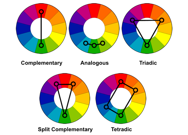
COMPLEMENTARY
- The high contrast of complementary colors creates a vibrant look especially when used at full saturation. This color scheme must be managed well so it is not jarring.
- Complementary color schemes are tricky to use in large doses, but work well when you want something to stand out.
- Complementary colors are really bad for text.
- example
ANALOGOUS
- They usually match well and create serene and comfortable designs.
- Analogous color schemes are often found in nature and are harmonious and pleasing to the eye.
- Make sure you have enough contrast when choosing an analogous color scheme.
- Choose one color to dominate, a second to support. The third color is used (along with black, white or gray) as an accent.
TRIADIC
- Triadic color schemes tend to be quite vibrant, even if you use pale or unsaturated versions of your hues.
- To use a triadic harmony successfully, the colors should be carefully balanced - let one color dominate and use the two others for accent.
SPLIT COMPLEMENTARY
- This color scheme has the same strong visual contrast as the complementary color scheme, but has less tension.
- The split-complimentary color scheme is often a good choice for beginners, because it is difficult to mess up.
TETRADIC/RECTANGLE
- Tetradic color schemes works best if you let one color be dominant.
- You should also pay attention to the balance between warm and cool colors in your design.
One combination that was not mentioned above is the square colour scheme.

SQUARE
- Square color schemes works best if you let one color be dominant.
- You should also pay attention to the balance between warm and cool colors in your design.
Colour Context:

"Red appears more brilliant against a black background and somewhat duller against the white background. In contrast with orange, the red appears lifeless; in contrast with blue-green, it exhibits brilliance. Notice that the red square appears larger on black than on other background colors."

The two smaller rectangles are actually of the same colour. However, due to the "context" in which they are placed, they look different.

"Observing the effects colors have on each other is the starting point for understanding the relativity of color. The relationship of values, saturations and the warmth or coolness of respective hues can cause noticeable differences in our perception of color."
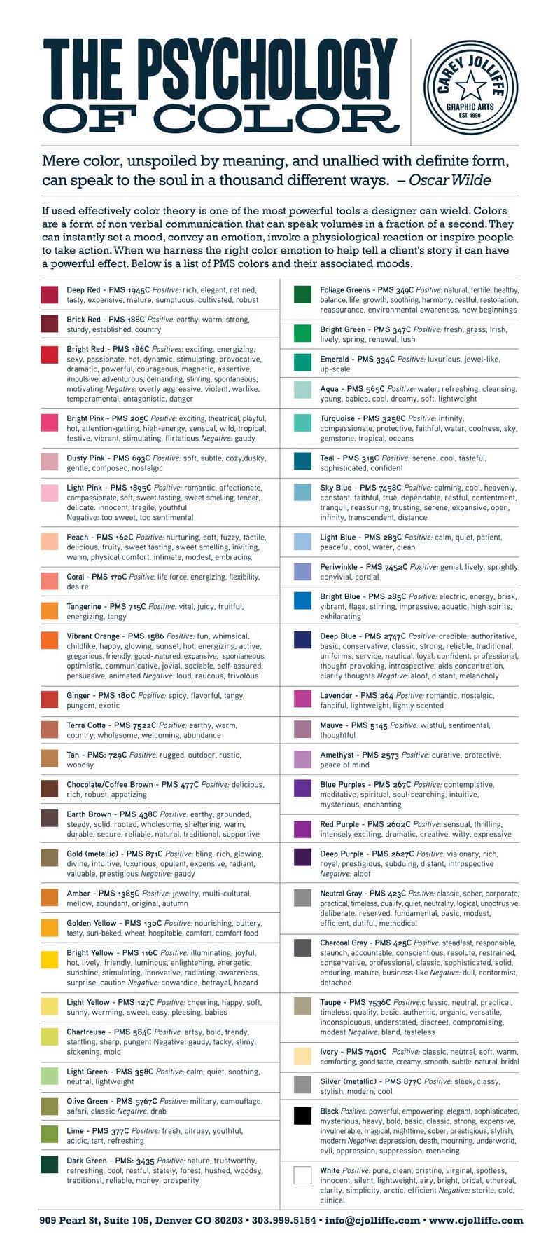
Psychology of Colour:
Application to Everyday Life:
1) Fashion
2) Interior Design
3) Presentation Slides - note that the selection of colours have to be viewable on a digital projector; typically, bright and high contrast colours are safe
General rule of thumb: Restrict yourself to three colors or less
Interesting Study on Tasty Colours:

References:
0 comments:
Post a Comment