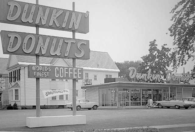
"In 1950, Bill Rosenberg opened the first Dunkin’ Donuts shop in Quincy, Massachusetts USA. Dunkin’ Donuts licensed the first of many franchises in 1955.
Today, Dunkin’ Donuts is the world’s leading baked goods and coffee chain, serving up fresh coffee, donuts and bakery items to more than 3 million customers every day."
Logo History:
1950 - 1956
1956 - 1960

1956 and 1960
(Alternate Logo)

1960 - 1961

1961 - 1970

1970 - 1976

1976 - 1979
1979 - 1987

1987 - 1990

1990 - 2002
2002 - 2007

2007 - Now
Note: A straightened version of the coffee cup was introduced after a few years but was not well received.
60th Anniversary Variant Used In 2010
- WIKIA
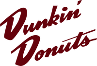
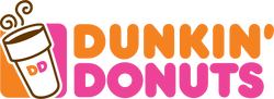
The Dunkin' Donuts logo becomes simpler and neater overtime. A simple logo with iconic colours allows for quick identification. It is also easier to remember.
Slogans:
- Only at Dunkin' Donuts (1950–March 31, 1991)
- The Place for Donuts and Coffee (1950–1964, secondary)
- America's Favorite Donut and Coffee Shop (1964–1967, secondary)
- America's Favorite Donut Shop (1967–1968, secondary)
- America's Donut Shop (1968–1973, secondary)
- America's Dunkin' (1973–1976, secondary)
- Always Dunkin' (1976–1979, secondary)
- It's Worth the Trip (1979–1990, secondary) (1997–1999, primary)
- Time to Make the Donuts (1979–1997)
- You Can't Get Better Tasting Coffee (date uncertain)
- You're Dunkin' (1980–1993, secondary)
- You're Still Dunkin' (1993–1997, secondary)
- Something Fresh is Always Brewin' Here (1997–1998)
- Loosen Up a Little (2000)
- One Taste and You'll Understand[31] (2001)
- Just the Thing (2002–2004)
- Bring Yourself Back (2004 – February 2006)
- Gets you Runnin' (2007–Present, secondary)
- Keeps you Runnin' (2007–Present, secondary)
- America Runs on Dunkin' (March 2006–Present, primary)
Products:
"Dunkin' Donuts is America's favorite all-day, everyday stop for coffee and baked goods. Dunkin' Donuts is a market leader in the hot regular/decaf/flavored coffee, iced coffee, donut, bagel and muffin categories."


Company Ethics:


Foundations

"The DDBRCF’s mission is to serve our neighborhoods through hunger relief, children’s health and safety initiatives."

Most iconic:
1) Colour

2) Typeface - Dunkin Sans Bold.otf. Dunkin Sans Bold Italic.otf.


- FLICKR
Dunkin' Donuts' logo is printed on all its products, with the same colour scheme. This serves as advertisement for the brand when consumers carry the products around.
In the Past


- FORBES
Ads in the past are more collage-like. The brand logo is included but the brand image does not really stand out. The designs do not "scream" Dunkin' Donuts.
NOW
Seasonal Ads


Wit

Trends

Shark Week - Shark Bite Donut
- ADWEEK
Minimal


Photography


- BEHANCE
Not sure if this is an official ad by Dunkin' Dobuts but I thought the artist's use of the brand's iconic colours and typeface, and negative space is very smart and effective.
Conclusion:
I noticed Dunkin' Donuts rarely uses their brand colours in their advertisements. Perhaps, it is because they are an old and established brand.
Ads in the past are more focused on advertising the "greatness" of the product directly, whereas ads today are more subtly and witty, and tend to incorporate themes such as studying (e.g. produnktivity ad).
Most ads today have various styles - photography, minimal, illustration, etc. They like to be smart with their ads, blending the message they intend to convey onto their products/packaging (e.g. their coffee cup). They like to be subtle, to invoke feelings they want their brand to be associated with. For example, the ad incorporating the matching coloured lips suggests that donuts are very delicious due to the graphic matches. This is despite the use of small donuts. The use of space is very effective here because it directs attention to the single element - the donut.
In modern ads, Dunkin' Donuts appears to attract consumers to the ad first before letting them know that it is an ad by them, because the brand logo is, more often than not, subtly placed in the corner. This can be seen in the rare use of their iconic colours as well.
On a whole, Dunkin' Donuts brands itself as a brand for the people, as can be seen from its various slogans over the years - it is affordable, accessible, supportive, and convenient. This can also be seen from its various ads. 'Produnktivity' is targeted at students, while the series with the lips is most likely targeted at young adults.
Today, Dunkin' Donuts also likes to collaborate with other brands to promote their product.

- ADWEEK
Sticking to the witty and simple designs, Dunkin' Donuts "is using 7 social platforms to sell iced coffee to music-loving millennials".


- ADWEEK
Here, Dunkin' Donuts has partnered up with Google to sell their coffees.
"Dunkin' worked with Johannes Leonardo and Trilia Media to build timetocoffee.com, which crunches two sets of data—the walk times to Dunkin' locations in the Times Square area, and current wait times at each—to determine which Dunkin' will get you coffee quickest.
Users who search for "coffee near me" on Google Maps or in Google Search on their mobile phone will see an ad that says, "Find the fastest coffee." Clicking the ad brings up Google Maps, which auto-populates the user's location and points to the right Dunkin' to patronize."
This is a really smart move by Dunkin' Donuts by making use of technology that consumers are already accustomed to.
The website is looking bit flashy and it catches the visitors eyes. Design is pretty simple and a good user friendly interface. www.telldunkin.com
ReplyDelete